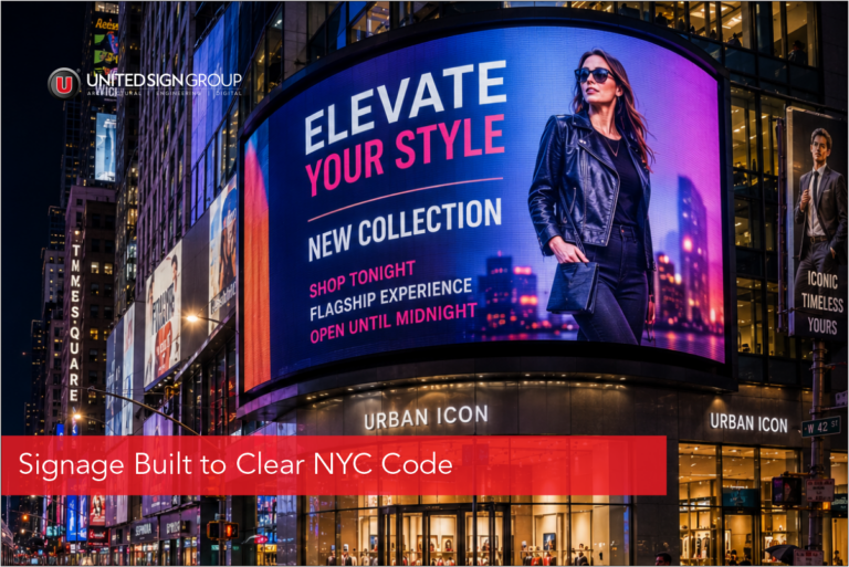


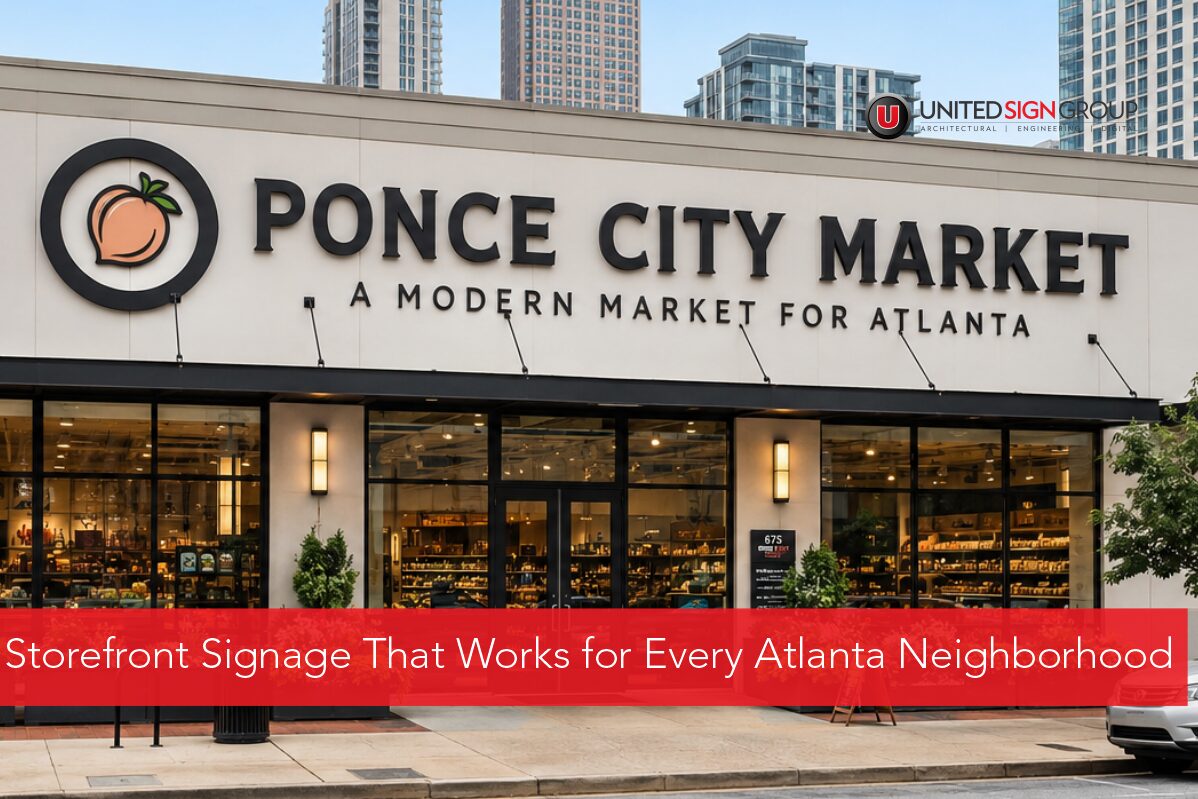
Atlanta storefront signage doesn’t work the same way in every neighborhood, and treating the city as one flat market is where sign budgets often go to waste. A sign that pulls foot traffic on Peachtree Street in Buckhead won’t necessarily read well on a Midtown high-rise, and what grabs convention attendees Downtown might feel out of place near an upscale boutique. Georgia’s capital is really three distinct commercial environments, and your signage should reflect that.
If you own a storefront or manage commercial property in one of these districts, here’s how size, brightness, and placement should shift by location.
Buckhead: Upscale Retail Needs Restraint, Not Volume
Buckhead is Atlanta’s luxury retail corridor, and the signage that works here tends to be understated rather than loud. Shoppers along Peachtree Road and around Lenox Square are often browsing rather than rushing, so oversized or overly bright displays can clash with the polished feel boutiques rely on.
What tends to work well:
- Channel letters and dimensional signage that emphasize craftsmanship over scale
- Buckhead digital signage used sparingly, often for rotating promotions or brand storytelling
- Warmer brightness levels, since low-rise retail strips don’t need skyline-level intensity
- Placement at eye level, matching pedestrian pace rather than trying to catch drivers on I-75
Property managers overseeing multi-tenant retail centers here should also account for HOA and design review boards, which often carry stricter aesthetic guidelines than other parts of the city.
Midtown: Designed for High-Rises and Mixed-Use Foot Traffic
Midtown is a different animal. Between office towers, apartment high-rises, and dense street-level retail, storefronts compete for attention from multiple directions: pedestrians on the sidewalk, residents looking down from balconies, and drivers along Peachtree Street.
Key considerations for this district:
- A Midtown Atlanta LED sign needs to read clearly both up close and from a distance, since your audience ranges from someone walking past to someone glancing down from a 20th-floor window
- Vertical placement matters more here than in Buckhead. Storefronts beneath residential or office towers benefit from signage positioned to catch eyes at street level and slightly above
- Brightness should sit moderate to high given ambient light from surrounding buildings, though Midtown’s mixed-use zoning often caps illumination, so check local ordinances before installing
- Heavy pedestrian and rideshare traffic near the Arts Center and Colony Square means quick-read messaging beats text-heavy designs
Midtown’s density means visibility windows are short. Someone walking past has only a few seconds to register your storefront, so simplicity in layout tends to beat detail.
Downtown: Built for Convention Crowds and Business Visibility
Downtown Atlanta runs on a different rhythm. With the Georgia World Congress Center, convention hotels, and sports venues nearby, signage here needs to work for an audience that’s often unfamiliar with the city and moving in larger groups.
What Downtown storefronts should prioritize:
- Downtown Atlanta business signage built for wayfinding as much as branding, since convention visitors are often searching for a specific address among tall, similar-looking buildings
- Larger-scale signage that holds up against the visual noise of Downtown’s skyline and stadiums
- Higher brightness for evening visibility, when foot traffic peaks around games, concerts, and conventions
- Placement that accounts for both street-level pedestrians and the elevated walkways connecting many Downtown properties
Property managers Downtown should also plan for event-driven traffic spikes. A sign that performs fine on a quiet Tuesday might get lost during a Falcons game, so plan for peak visibility rather than average visibility.
Zoning and Visibility Differences Across the Three Districts
A common mistake is assuming Atlanta’s sign codes are uniform citywide. They’re not. Buckhead’s overlay districts tend to favor smaller, more residential-friendly signage. Midtown’s zoning balances commercial visibility with surrounding residential towers. Downtown’s codes lean more permissive for larger, brighter displays given its business and entertainment-district status.
Before finalizing any sign design, confirm the permitted size, brightness limits, and placement rules for your specific address rather than assuming what worked a few blocks away will pass review in your district.
Getting Signage Right for Your Atlanta Neighborhood
Buckhead, Midtown, and Downtown each ask for something different from a storefront sign. Getting size, brightness, and placement right isn’t just about following code, it’s about matching how people actually move through each part of the city. A sign built for slow-paced Buckhead browsing won’t hold up against Downtown’s evening event crowds, and a design meant for convention visibility might feel heavy-handed in a Midtown lobby.
United Signs has worked across Atlanta’s commercial districts, handling design, permitting, fabrication, and installation, and understands how local codes and neighborhood character shape what works where. United Signs’ Atlanta location page outlines their full-service approach to the city, including permitting support and materials built for Georgia weather.